User selection
End users read each component’s description and toggle its checkbox. Enabled components have their files extracted; disabled ones are skipped.
When your package contains multiple components, you can display a component selection dialog that lets end users choose which ones to install. Each component appears with a checkbox, a title, and an optional description.
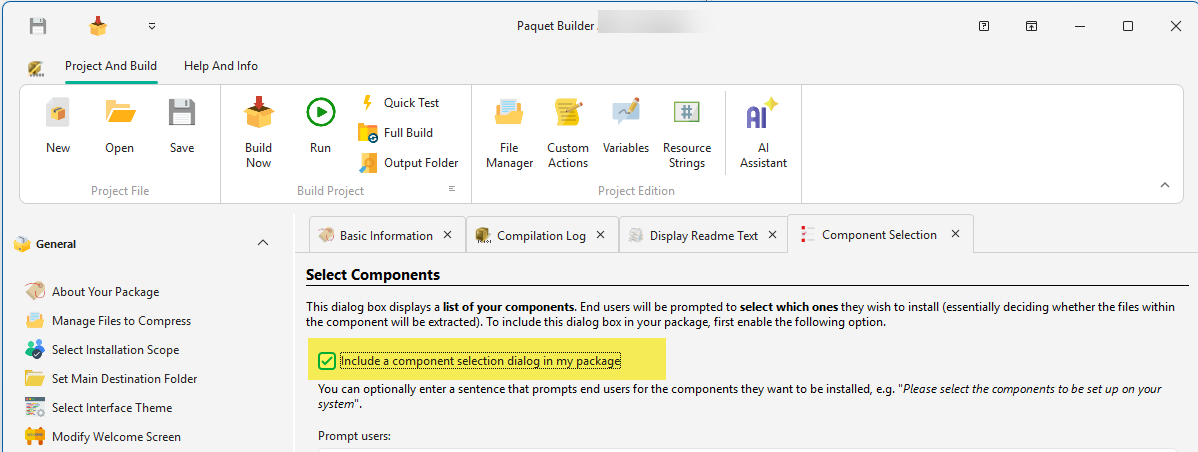
To enable this dialog, activate the “Include a component selection dialog in my package” checkbox.
In the installer, end users see a list of components they can toggle on or off:
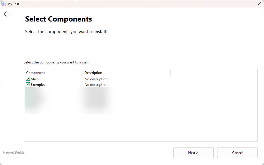
User selection
End users read each component’s description and toggle its checkbox. Enabled components have their files extracted; disabled ones are skipped.
Component variables
Each component has an associated variable. When enabled, its value is 1 (true); when disabled, 0 (false). You can also modify these variables programmatically with custom actions.
Title and description
Customize the Component Title and Component Description in the Component Properties dialog — double-click a component in the list to open it.
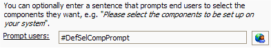
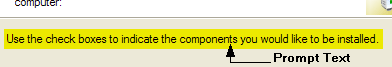
Prompt text
Customize the instructional text displayed above the component list using the “Prompt users” field. Resource strings are supported (e.g. #DefSelCompPrompt).
By default, components appear in the order they were created, with Main always first. You can rearrange them with drag-and-drop:
The “Prompt users” field controls the instructional text shown above the component list. You can use a resource string for multilanguage support.
In the package at runtime:
In Paquet Builder: